Chief Meta Chicks
A bold new brand empowering women in the Web3 space to 'get their wings on'

Launching a brand in the Web3 and tech space is one thing, making it feminine, empowering, and distinctive is another.
Chief Meta Chicks needed a brand identity that balanced digital sophistication with female-led empowerment. As a new company entering a crowded, male-dominated space, the brand had to:
- Cut through the noise of corporate sameness
- Feel aspirational, stylish, and community-driven
- Scale across digital, podcast, social, and event experiences
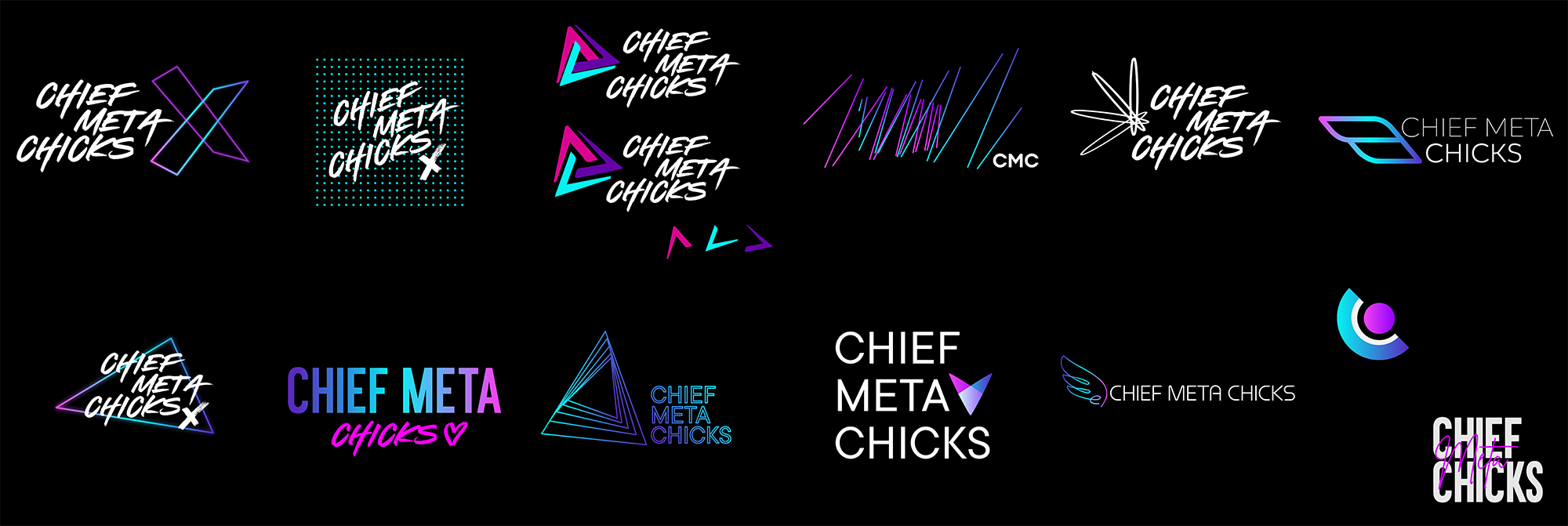
The early exploration was intentionally broad bold sans-serifs, abstract symbols, ultra-feminine logotypes. Through rounds of refinement, one symbol rose to the top: a pair of wings.
Not just decorative, the wings became a visual metaphor for lift-off, empowerment, and elevation, expressing exactly what the brand stood for. From there, the entire system evolved: soft, flowing curves over harsh edges, confident typography, and a hero tagline born from the logo exploration itself: "Get your wings on."

Logo
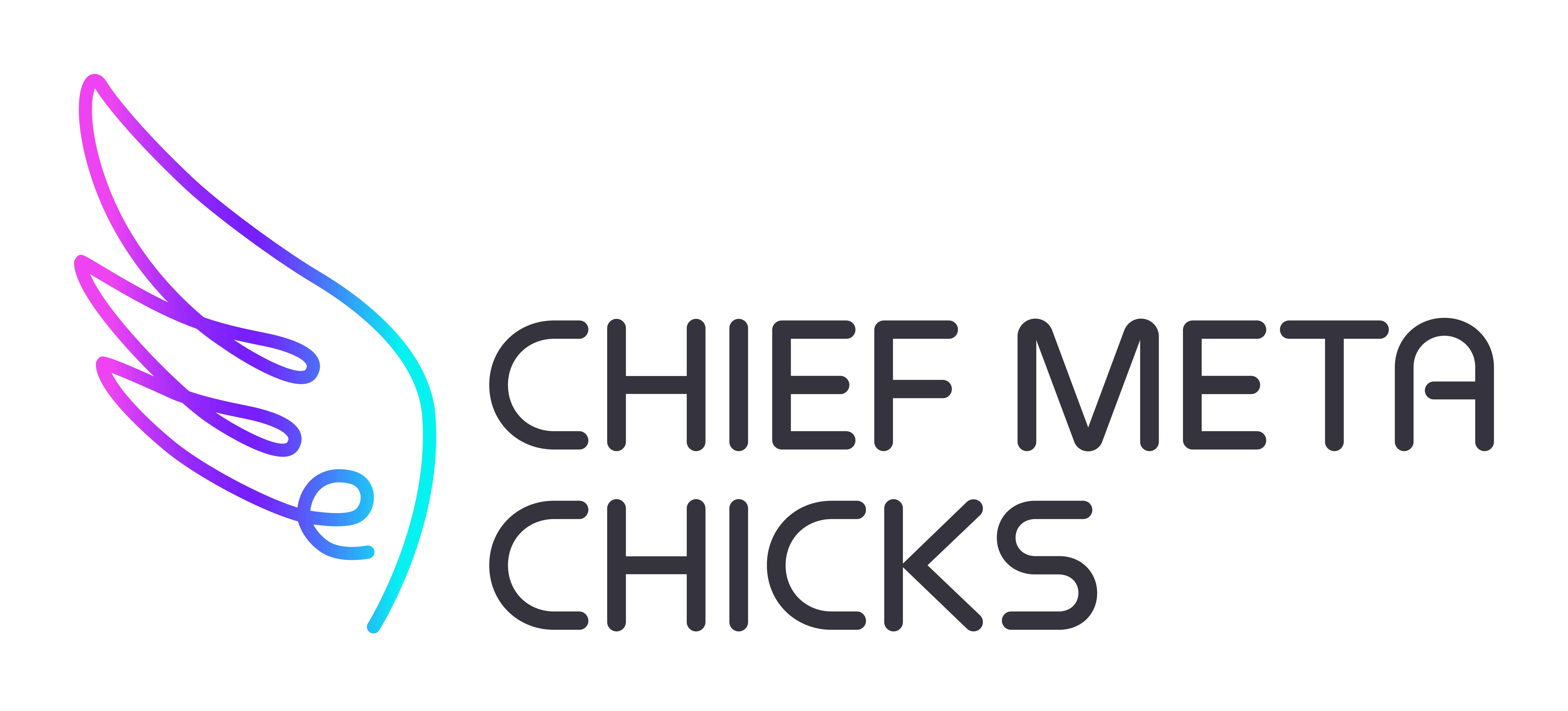
The final logo combines a bold stacked wordmark with a flowing wing icon - adaptable across digital, print, merchandise, and media. The wings extend outward, encouraging interaction and creating a visual moment at activations and events.
Typography
The custom wordmark blends geometric structure with subtle softness - striking a balance between tech credibility and approachability.
Colour
A palette of bold and pastel tones adds contrast and flexibility across brand touchpoints, allowing the brand to flex from energetic to elegant.
Imagery
Social tiles, podcast art, and event assets use layered shapes and soft gradients to create movement and texture. The wings also double as interactive photo moments, people literally stand in front of them and take off.


Chief Meta Chicks launched with a bright, confident brand that people connected with instantly. It stands out in the Web3 world for all the right reasons—visually distinct, emotionally charged, and built to scale.
"It's the kind of brand people want to stand in front of and be part of."
Client feedback from launch event
Since launch, the identity has been rolled out across:
- Podcast artwork and social promotions
- Digital banners, assets, and email templates
- Community engagement tools
- Event signage and media kits
The brand has sparked real-world engagement, with women proudly posing with the wings owning their space in a new digital future.


