
Ignite
A boundary pushing brand for sponsorship growth powered by tech, performance, and synergy.
Ignite is a unique proposition born from the collaboration between Greenroom (digital sports/commercial experts) and Partnerbrite (global sponsorship technology) launching a brand that captures momentum, innovation, and partnership.
The brief:
- Reflect synergy between two parent brands
- Avoid clichés: no literal flames despite the name
- Express momentum: energy, precision, and forward motion
- Appeal broadly: from strategic clients to technical audiences
To bring Ignite to life, we started with visual deconstruction and metaphors of propulsion. Flames and rockets were tempting, but too expected. Instead, we leaned into rocket fins not for their literalness, but for what they represent: direction, lift, stability, control.
We sketched multiple fin-style motifs with varying geometry and overlap, exploring how two forms could intersect, combine, or push into one another. The intersection zones became the visual ignition point - symbolic of collaboration and energy.
We refined that through shape, alignment, negative space, and balance until we found a configuration that felt dynamic yet grounded.
From there, we built the visual system:
- A refined logo mark using two intersecting fanned shapes
- A bold, modern logotype to sit alongside or stand alone
- A modular system where the fin shapes could animate, repeat, mask, or brand motion assets
- Colour and typography choices that balance boldness with technical elegance
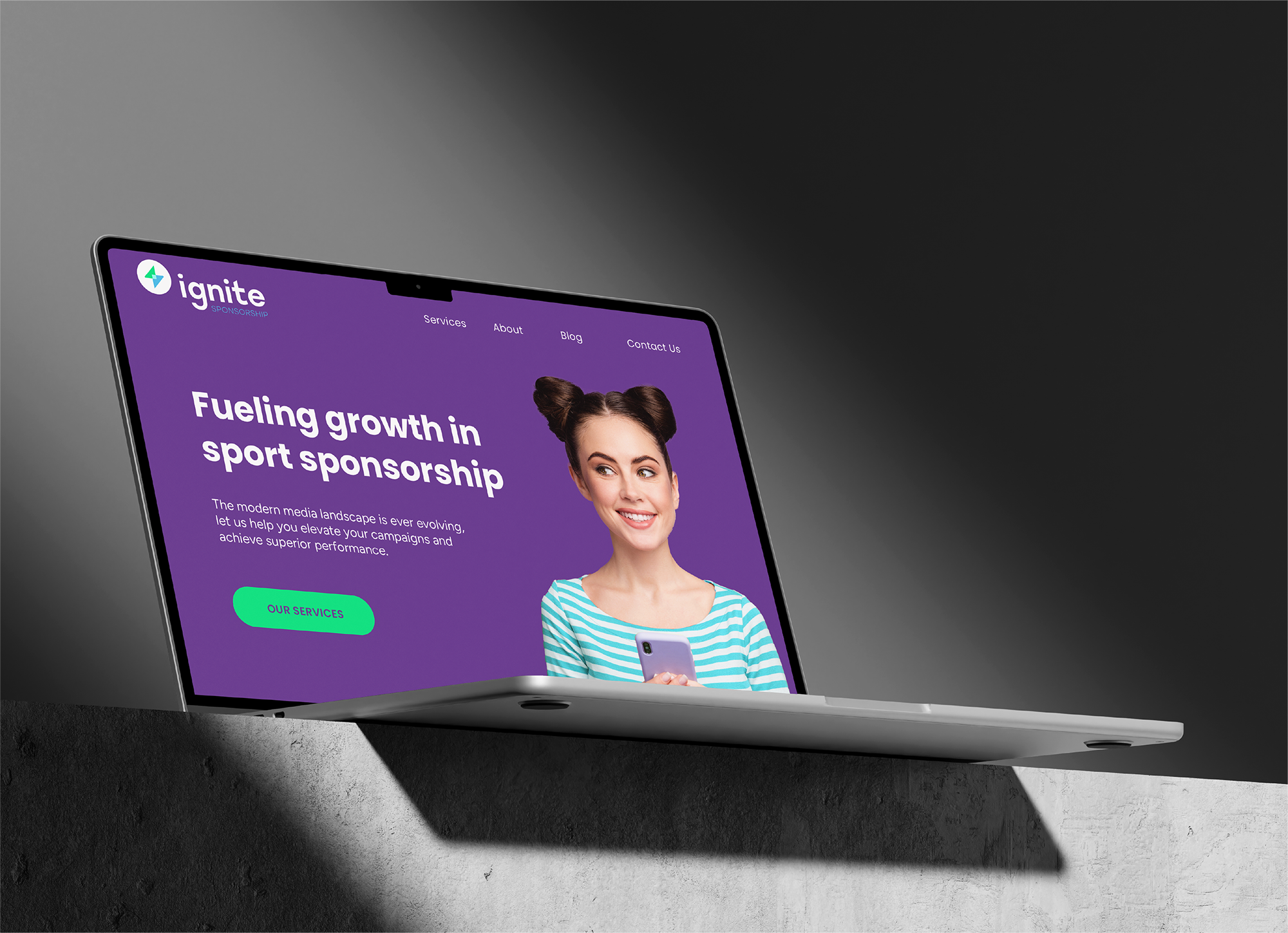
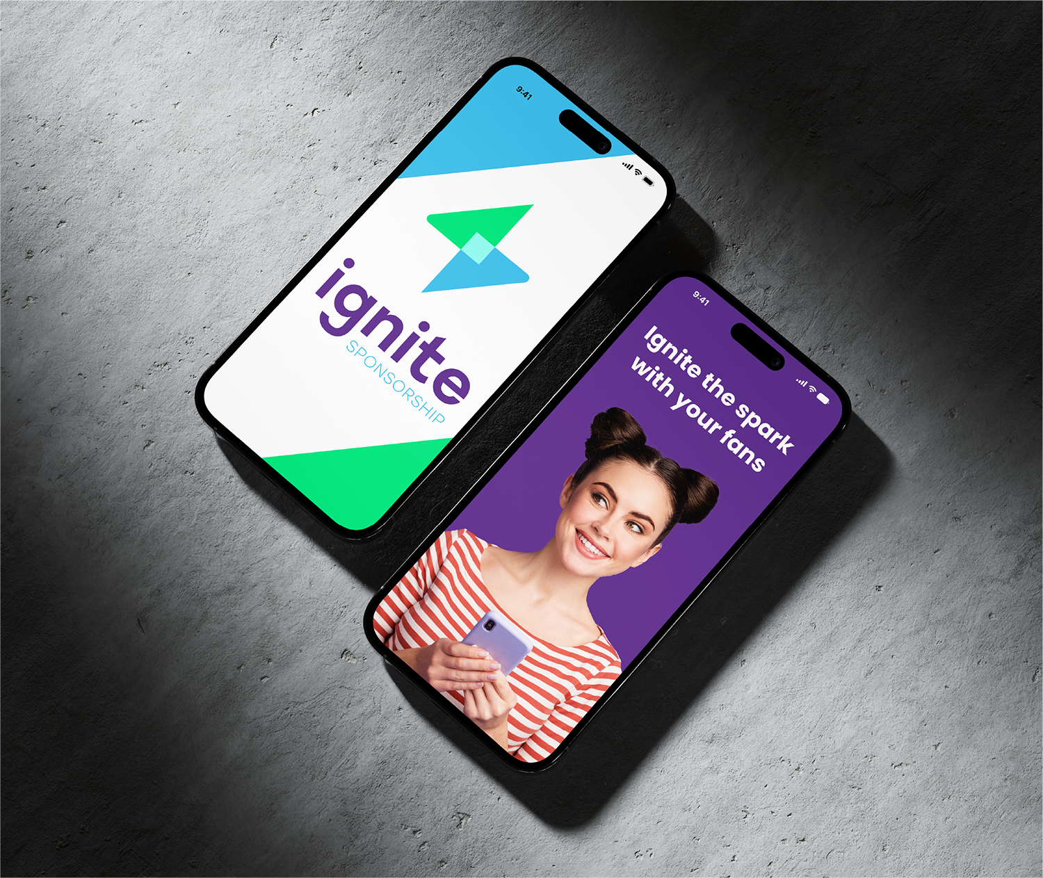
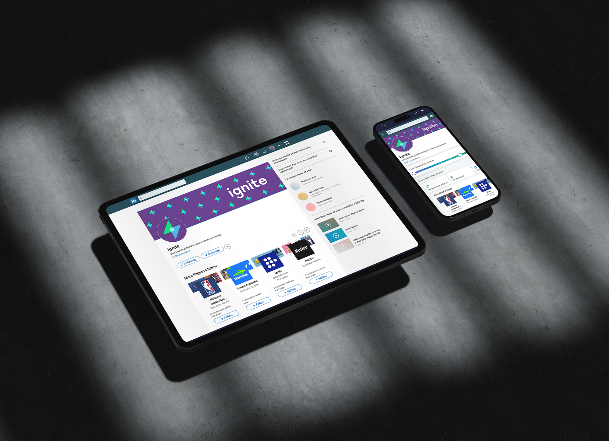
The strategy was to make every element feel part of a propulsion system: individual parts working together to fuel growth.


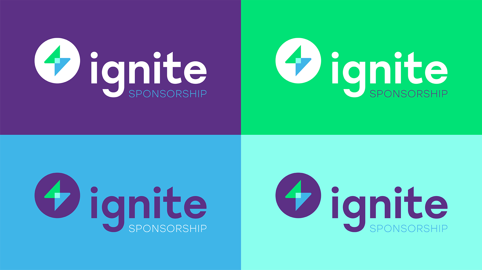
Logo / Mark
The final mark is two angled "fin" forms in dynamic alignment. Each fin is distinct, but their overlap is the "spark" where strategy, tech, and execution meet. It functions well as a standalone symbol or as part of a lockup with the logotype.
Typography
Clean, geometric sans-serif fonts support clarity and digital-forward utility. They let the mark take visual priority without competing.
Colour
A primary palette grounded in deep neutral or dark tones gives weight and sophistication. Accent colours are used sparingly to highlight momentum or key messaging. The fin shapes use subtle gradients or tonal overlap to convey lift or depth.
Visual Language / Motifs
The fin geometry is replicated in UI/animation, motion graphics, and background elements. Overlapping strokes, angular masks, and directional gradients reinforce the sense of movement and collaboration.

Ignite emerged with a visual identity that speaks of momentum, technical discipline, and partnership not just hype. It's immediately distinct without being over-the-top, balancing serious tone with energetic spark.
With clear brand guidelines, lockups, modular assets, and rollout-ready visuals, Ignite is set to scale across digital, pitch decks, brand touchpoints, and beyond. It now has a foundational identity that captures the nuance of performance and partnership.
